Bears


Did you ever play a game and set the level to the highest just to see if you can beat the game?  Or try a recipe that may be out of your skill set just to see if you can do it?  My newest project is just that for me.  I was in a gift store one day and saw a sign that said, "What doesn't kill you will make you stronger, except for bears, they will kill you."  I kind of found this funny.  Granted, it was a sign meant to hang in a cabin.  I don't have a cabin but I live in Bear Country.  That is, Boyertown Bear Country.  My daughter was a Boyertown Bear, my son was a Bear, my niece is a Bear, my nephew is a Bear and I am a Bear because I work there.  I challenged myself to make a design that was my style using this saying for no reason whatsoever, just because I wanted to see what I would come up with.  I just finished the classroom signs, so the bear graphic was still on my desktop.  I wanted it a little bit vintage and a little bit grungy...faded colors but still school colors.  I think this print in my home would be a great piece to add to all the sports pictures.  So, if you know football player, soccer player, cheerleader, etc. that wears the Bears uniform...go kill 'em Bears!  #onthescoreboard!

#gobears

0

Autumn Print


Now that fall is officially here, I can finally get into the mood.  I do enjoy fall.  Fall is a candy store for the eye. So I pulled out my fall decorations out of the attic.  I noticed that the space over my fireplace needed a little color.  I could just make another wreath but it becomes repetitive.  I have many wreaths around my house.  I needed something a little different.  I love the quote "Autumn is a second Spring when every leaf is a flower." I created this Autumn print to hang there.  Using a red Maple leaf, I used PhotoShop and made it look watercolored.  I created a canvas background instead of stark white one so it looked warm. I added a grungy overlay...because I like things a little grungy.  I added type.  I designed the quote so it was a little vintage in style.  I had it printed on 16" x 20" matte photo paper from Walmart.  I grabbed a poster frame at Michaels.  It was 70% off.  So it was cheap.  I loved how the black type accented my wooden candle pillars.  I purchased black and white ribbon at tea-dyed it. Again, the white was to stark. This will hang on my mantle until the day after Thanksgiving when I decorate for Christmas.  I hope you like how it turned out.


If you notice my little scary cat plate, I painted that a couple of years ago.  I found a wooden plate at a thrift store.  I think it was 50 cents. I sanded it and painted it black with craft paint.  I painted the cat's negative space white with craft paint.  I sprayed it with a clear matte finish (I could do that because this will never be used for food).  I decorate with this only for Halloween time.  I love how the black in the plate, the black in the print and the black candle pillars all work together.  It gives it a Halloween feel.

Happy Fall decorating everyone!
0

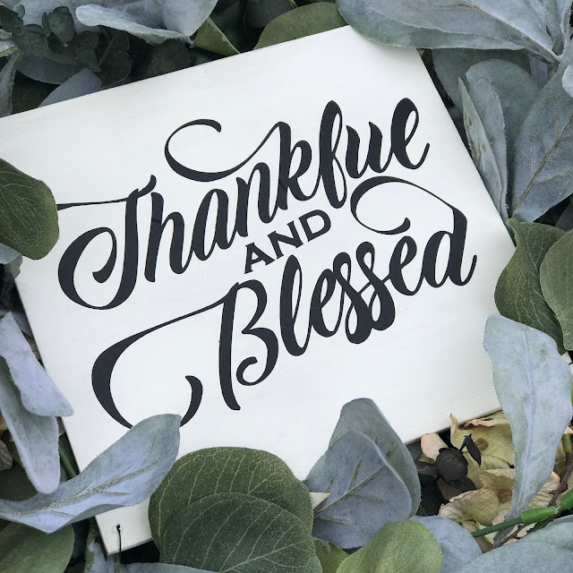
Thankful & Blessed Lettered Sign


Now that fall is just about here, I began to take out some decorations.  I wanted a wreath for my front door but wasn't feeling the store bought ones with all those styrofoam pumpkins with orange and red ribbons.  I love how the trees look when they turn but I wanted something a little more subtle greeting people at our front door.  I had a grapevine wreath in the attic to which I added some eucalyptus and some dried flowers.  I found silk branches in the floral section at Walmart for pretty cheap.  One was Green Lamb's Ear for $.97 each and the other was Green Eucalyptus Stems for $2.00.


As artificial flowers go, they are very inexpensive.  I had planned on painting a sign to make it more personalized.  Sometimes I can't help myself using typography in home decor.  Design should be enjoyed everywhere!  I used Adobe Illustrator to manipulate this pretty script font.  I added some flourishes and stylized the type to give it that custom hand-drawn look.  I used my Cricut to cut out some matte black vinyl.  It does look hand-lettered.  I cut a piece of scrap 1/4" ply-wood, sanded and painted it white. Small holes were drilled in the corners so I could wire tie it to the wreath. Thankful & Blessed only seemed appropriate going into the season of giving.  Happy fall everyone!  I hope you have a wonderful first weekend in fall!


0

A Throw Back Backdrop


It's TBT!  I thought this was an appropriate post since fall is right around the corner.  This is for all the Halloween lovers.  I created this photo booth backdrop for Prom 2017.  The theme was Masquerade.  I think this would be an awesome idea for a Halloween Party.  Can you see it?!  Selfies galore!  The black background would highlight everyone's costumes.  This was the biggest thing I ever hand-lettered.  It wasn't hard painting it, it was hard to find the space to do it.  I thought I was going to use plywood for the backdrop, but it was too heavy and expensive.  I searched on the internet for some alternate ideas.  I found that professional photographers use foam insulation boards sold in hardware stores.  They come in 4' x 8' panels.  I bought two from Lowe's.  I used chalk board paint I also bought at Lowe's.  I used a roller to get the smoothest finish.  Once it dried, I sketched out my design and painted it with chalk paint I purchased at AC Moore.  


I used a coupon...of course.  It took me a couple of days to finish the painting. I delivered it and ducked taped the panels together when I got there.  I used command strips to hang it on the wall.  Although it was 8' x 8', it was light so it worked like a charm.  


So, here is an idea for your upcoming halloween shindig!  Grab some foam boards and paint and you'll have a unique backdrop for your guests.  


0

Whale of an Art Project


When my son was younger, he was fascinated with the documentary "Black Fish" on Netflix.  He made everyone in our family watch it.  We talked at length about the intelligence and skill of these animals.  He was intrigued by how they raised their young, traveled and worked together in pods to live harmoniously as a group.  They were like a well-oiled machine.   He also became outraged by Sea World keeping these whales in captivity.  He watched as many documentaries on these whales as he could find.  We also took a family vacation to Boston which included a whale watching tour.  So it was only natural that when he turned 18 he wanted a tattoo honoring his favorite animal.  When I was a kid I might have bought a poster to hang on the wall or a key chain...but it was 2017, a tattoo is what kids do.  He had an idea in his head of what exactly he wanted.  I was pleased that he asked me to design it.  


He was very specific to get the whale correct down to the fin.  Once we figured that details, he suggested that the whale be filled in with Roses.  He likes roses and his grandmother's name is Rose.  He is a thoughtful young man.  I am blessed that he wanted something I created.  The tattoo artist did a great job doing the rest. 


This photo was taken right after the tattoo was completed.


This is how it looks today.
0

Life's Little Treasures Vintage Label


I am a very sentimental person.  I like to hold onto a few things that remind me of something from the past. I don't keep a lot of things, just a few.  This summer, while my family vacationed in Mexico, my husband and I took a walk along the beach.  I found a few unique treasures that I stuck in my pocket as we walked. I managed to bring them home without crushing them in my bag.  When I got home, I had a small canning jar that they fit into perfectly.  I also have a glass vase with some small pinecones I picked off our tree before we moved from the house that we raised our kids in. I kept those pinecones, half because they are sentimental and half because those pinecones or so darn cute.  I created labels for the jars to mark what is inside. I created them in Adobe Illustrator to look like vintage labels.  I printed them on Avery Full Sheet Sticker Paper and cut them out with scissors.  I can fit 6 on one sheet so I have a label ready to go when I need it.  I typed where I found my treasure and the date.  You can also hand write that info to make it even more personal. I always keep sticker paper in my printer supply stash.  They make great labels for gifts too when I want something a little out the ordinary.  

So, in the spirit of beautiful fall weather, get out and find some little treasures of your own. 


Just right click on the label to either copy or save a copy for yourself.
0

Yum Yum for Your Tum Tum Free Download


Now that the cooler weather has started, my husband likes to enjoy a cup of coffee after dinner.  Sometimes he needs something a little sweet to go with it.  I discovered this perfect Biscotti recipe. 


It is very easy and makes a good amount.  Since he enjoys it so much, I thought to share this little treat.  I created a cute package that holds two Biscotti cookies...perfect for a morning coffee in the office.  I figured something packaged so lovely will taste equally as good.  It is a personalized touch that I think people really appreciate. Designed in Adobe Illustrator and printed on plain white computer paper, all I needed to do was fold and add the cookies.  I tied it up with some twine. 

 
I really thought this was an easy way to present something that I baked.  I am offering a FREE DOWNLOAD for your next batch of cookies.  Just click the link, print and fold.  I left the Homemade line blank so you could add the name of your personal yum yum.  Happy weekend!
#imadethis #typographyforthekitchen #personalizedgift #homemade #adobeillustrator #packagedesign #biscotti 
0

School Pride Classroom Signs


School has been rolling along.  Our first full week back...who is still adjusting?  I work with a lot of great and talented people.  They are very good at what they do.  I do not know how they do it...everyday!   I am in awe.  So when I can be of some creative service to them, I jump on it.  A few classroom signs were needed.  Why not show some school pride?! I thought, anything to use my favorite font, Copperplate Gothic Bold (used for the name), my favorite bold san-serif font, Impact (used for the room number) and a new font I just found, Upbolters (used for Boyertown Bears).  If you could not tell, I love fonts.  I will not tell you how many I have, it's kind-of an addiction. 


I designed this in Adobe Illustrator and PhotoShop, then printed on glossy paper.  I cut the corners with a punch, added in a ferocious bear and school colors. Can you say school pride?!  #GOBEARS


0

Creative Home


Why do I make stuff? Why do I feel the need to decorate my house with pretty things?  I guess it is my need to be creative...to create a mood and a feeling with design. That's why I love what I do.  When my children were small, we never really had much money to spend on artwork for our home.  But I still wanted it to be warm, inviting & beautiful.  I tried to create things from found items or something I could design on the computer and print cheaply and frame. The above photo is something I made awhile ago, but it still sits on my open shelving in our living room.  I created a faux chalk board background in PhotoShop and put type on top.  I printed it black and white on plain computer paper.  My husband had some left over 1/4" plywood in the garage.  I wrapped the print around the plywood and stapled it on the back.  A simple, cheaply-made item that means a lot to me. I think it feeds the need to be creative and it is something beautiful for my home.  Win, win! 


0

How to Make A Rope Basket


This summer we visited Ottawa.  It is a beautiful city.  We did all the touristy things; visited the Parliament building, saw the changing of the guard and checked out the Rideau Canal.  After we headed to the shopping district, we had lunch at an outdoor pub and did a little shopping in the street market.  My daughter picked up a rope bowl for her kitchen table from a booth selling African crafts.  It was rope sewn together with tread.  I was intrigued by this and wondered if I can make it myself.  When I got home, I took to Pinterest.  There are lots of ideas on rope bowls and baskets.  There is no easy way of learning something new unless I actually do it.  Here is what I did.

What you need to start this project:
A bowl or bucket to use as a guide
Hot glue gun & glue sticks
Scissors
Rope (I purchased mine from Lowe's)

Optional items:
An old leather belt (Thrift store find, $3.99)
Round headed fasteners (brass brads)  (Staples)
Hammer & Hole Punch (Making Memories)
Carpet knife & cutting board

1. Gather your materials.  Heat up glue gun.
Cut the end of the rope clean and hot glue the end so it doesn't fray.


2. Begin twisting it around and glueing between each row as you go. Use the bottom of your bucket or bowl to guide you so it stays flat and tight.  Do not glue it to the bowl or bucket.  Some glue might get on it so when it cools, make sure it is not stuck.  


3. Work up the sides to desired height.  Remember to keep the glue from sticking to your bucket or bowl.  If you run out of rope and need more, cut the end of the rope clean and hot glue the end so it doesn't fray. Continue by gluing the two ends together. Once you achieve the desired height, cut the rope and glue the end so it doesn't fray. Tack it with hot glue in the inside.


4. These next steps are optional.  I knew I wanted leather handles on mine.  I found a belt at my local thrift store for $3.99.  I cut the belt with a carpet knife.  The leather was too thick for scissors.  I punched holes in them for the brass brads.


5. I pushed the tabs of the brad between a row of rope.  You might need to use something sharp, like scissors to help punch threw some of the glue.


6. Once you have it positioned, add a little hot glue on the back side of the leather to secure it.


That is it.  Be careful not to burn yourself with the glue.  


0

DIY Sneak Peek


Happy Sunday! I have been working on a DIY project this week and I am almost finished.  Here is a sneak peek of what is coming.  Please check back tomorrow to see all the details and a "how to".
0

Hand & Soap

After my kitchen remodel, I did not want plastic bottles of soap messing with the aesthetic. Ikea has these cute soap pump dispensers that looked perfect on my farm sink. They are glass and I was afraid of knocking them over and breaking them. I always have reclaimed wood in my garage, so I made boxes to fit the two bottles side by side. 


One for hand soap and one for dish soap. I created a custom stencil on my Cricut. A little paint and some clear sealer to protect it from water and all those plastic bottles were gone! I made one for my mom too!
0

Window Command Center


Happy Labor Day! It always feels like the last day of summer. Back to routines & schedules. So I had them in mind when I made this project. I had a couple of old wooden windows (without the glass) in my garage. My husband cut a piece of clip-board material to back it. It is lighter than wood and extremely smooth so it takes chalk board paint well. 


I cleaned the window from all the cob webs and lightly sanded. I pulled out my chalk paint and painted it white. While everything was drying I headed to my computer and Cricut. I made a few quick banners in Adobe Illustrator and added type. I created stencils for the days of the week and used the same chalk paint to stencil it. 


I thought it need a handy place to hold papers, extra chalk, pencils... so my hubby created a narrow box out of salvaged fencing, which was ready for the garbage, that I nailed to the bottom of the window. It now is a perfect command center for school lunch menus, game schedules, dance lessons, dinner menu, etc! Have a great organized day!!
0

Farm Fresh Pumpkins & Free Print


I have been making a lot with my Cricut but sometimes I go back to my roots and digitally design a home decor project. Since it is Fall, I created a pumpkin patch sign that I had planned on painting. I always design it first in Adobe Illustrator no matter if I cut a stencil or not. In Adobe Photoshop, I can create just about any look. So I gave my Cricut a rest. With the magic of computer technology, I can age it and create something that looks old and worn. I had my hubby put together a reclaimed frame for me.


I also had an empty 11 x 14 frame with an 8 x 10 mat from Michaels that I thought would work too. The nicest thing about creating it digitally, besides not having paint brushes to clean, is that I can share it with you. Feel free to download a copy for yourself or send it to a friend or do both!


0

Search This Blog

Powered by Blogger.